Posted: January 12th, 2026
Your Website Hero Section And How To Make That Critical Space Count
One thing hasn’t changed much since the popularity of “above the fold” became a thing on the web and that is you probably have less than 3 seconds to grab your visitor’s attention on your home page. Yes, people DO scroll (I wrote a whole thing about that here), but many will bounce right off your site if they don’t immediately see something that makes them WANT to scroll.
So not a lot of time to make a great first impression when a visitor comes to your website. Within those first critical seconds, customers are making a decision of whether your company can solve their problem.
What Exactly is the “Hero” Area on a Web Page?
What we now call the hero section is the top chunk of screen real estate at the top of your web page (no matter what screen your audience is viewing your website on). This is what your visitor is going to see first. The term is a nod to “hero image”, originally used in print design to describe the main, eye catching image for the top story on a newspaper.
What can make or break a Hero section?
What content goes in this section can really make or break whether your site visitors stay or bounce and while it’s typically most critical in your home page, I advocate that it shouldn’t become an afterthought on all the other pages on your site. Care should be taken on every page to capitalize on your visitor’s attention and make sure they see what they want.
Break it:
A weak headline over a large stock image or video background.
- Weak headlines are ones that don’t answer the who, what, and most importantly, why (example: “Welcome to Our Website” or “Excellence in Everything We Do” or “Helping You Achieve Your Goals”).
- Weak headlines are ones that focus on you alone (example: “We’re an awesome company!”).
- Weak headlines are vague (example: “We Provide Innovative Solutions for Your Success”).
- Weak headlines have too many meaningless buzzwords (ex: “Next-Generation Platforms Disrupting for Success”).
- Weak headlines try to be clever but fail (ex: “Unleash the Possibilities”).
Equally bad is when you have what I call the, “wall of text” problem. This is where there’s a paragraph or more right at the top of the home page. Pretty much no one is going to read that, so just don’t do it on the home page. Once a visitor has decided to explore further into the site, more text can be effective (but I still suggest considering formatting to make the text more readable).
Poor Image Choice
Another way I see this fail is no consideration given to how easy that text is to SEE on a background. There has to be sufficient contrast, so if you do go with a large image or video, having that show at full opacity is usually a recipe for disaster.
Moving video backgrounds and slideshows can also be problematic because the distract from the headline, so be careful with visually intense, moving backgrounds.
I’ve also seen things like obvious AI generated images, overly posed-stock images, blurry or out-of-focus DIY images
Multiple or Unclear “Calls to Action”
A call to action is simply the main thing you want the visitor to do is. Sometimes, it actually can work to have something like 2 buttons under the main headline in situations where you are serving 2 main audiences or have 2 key service offerings, but often times it just clouds your messages or confuses what action you want the visitor to take.
Being wishy-washy with the call to action can also make things unclear. For example, a “learn more” button without a really strong headline/supporting headline intro to give context or something like a link that just reads: “click here”. I’m also not a big fan of something like, “contact us” or “book now” as the first calls to action seen in the hero area. Why, you may ask? It would be like walking up to a stranger in person and after a one line introduction, asking for their phone number or a meeting.
Make it:
What works much better than headlines like the above are brief, descriptive ones that show a visitor exactly who you are, what you do and most importantly, what’s in it for them. Remember, you have a very limited amount of time to capture attention.
Here’s some examples of better headlines:
-
(For a doggie day care) “A Safe, Loving Place for Your Dog—When You Can’t Be There”
(For an estate planning attorney in Oregon) “Protecting Oregon Families Through Compassionate Estate Planning”
(For a therapist in Austin, TX) “Evidence-Based Therapy for Anxiety and OCD in Austin”
(For a plumber) “From Quick Fixes to Full Remodels, Your Trusted Local Plumber”
And there’s absolutely nothing wrong with an equally well-written secondary or supporting line of text to the main, large headline.
When it comes to pairing your well-written, emotional, and who/what/why headline with imagery there’s a number of things that can help.
- Make sure any imagery complements the headline. I’ve seen poor image choice create a conflicting message. Remember, people will often see an image first and THEN start reading any text that goes along with it.
- If you are going with one large image, consider an overlay to heap with text readability.
- It doesn’t have to be one, large “hero” image/video. There are a lot of options when it comes to using imagery, illustrations or other graphics with placement (example: image to the side or below the headline). Also remember, white space is your friend and let’s content “breathe” and gives the visitor’s eye a rest.
- Remember that images can also enhance emotion in a viewer.
- Consider images that actually show the results of your product or service.
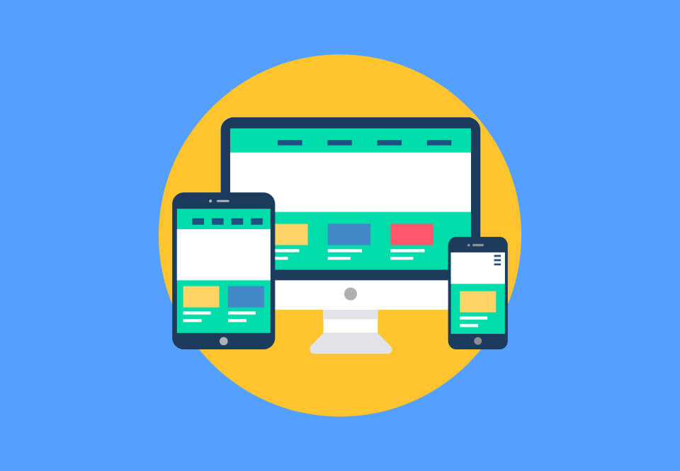
- Ensure everything still looks great on different screen sizes.
- Consider hiring a professional photographer if you’re a professional service business (headshots, office photos, etc.) or those photos would really enhance what you’re offering (example: a travel destination, an entertainment venue, you’re selling a product, etc.).
A clear Call to Action
It may seem like I’m advocating for just ONE call to action, but really, there can be secondary calls to action further down the home page (that’s actually considered “guiding their journey”). What I’m saying is there should be one MAIN call to action and it needs to be super clear.
Remember, you’ve got a few seconds when a visitor arrives on your site. They’re absolutely making a judgement and deciding whether it’s worth their time to stay and find out more information. You don’t want them to have decision fatigue by hitting them too many options.
Wrapping this all up…
The main point of your hero section is to make people stick around and learn more. So it needs to be able to convey your message quickly about who you are, what you offer, and what you’re offering to your your potential customer (how you solve their problem, etc.).
Hopefully, I’ve given you some good examples of what doesn’t work well as well as some that do to put your best foot forward and capture your audience’s attention.